
Introduction: Why Color Choices Matter for Interior Painting in Chicago
Choosing paint for interior painting in Chicago is about much more than picking a pretty swatch. The right colors can make your home feel warmer in gray winters, brighter on cloudy days, and calmer when life is hectic. Done well, your walls support how you live every single day.
Chicago homes and condos deal with unique light: long stretches of overcast skies, lake-effect brightness, and big mood swings between February and July. That means a color that looks airy in a Phoenix showhome can feel icy and flat in a Logan Square living room by January. Design and paint trend coverage shows many homeowners are moving away from cool grays toward warm neutrals, earth tones, and richer greens and blues that feel cozier and more personal indoors ([Benjamin Moore color trends](https://www.benjaminmoore.com/en-us/color-overview/color-palettes/color-of-the-year-2024), [Homes & Gardens paint trends](https://www.homesandgardens.com/interior-design/paint-trends)).
This guide walks you step by step through how to choose the best colors for your rooms, with a clear process you can follow in any Chicago space. You will see how to start with mood, factor in local light, build a cohesive palette, and test colors the right way. And if you decide you would rather have a pro handle the interior painting in Chicago for you, Noir Painting is here with color guidance and turn-key painting services.
Step 1: Start With How You Want Each Room to Feel
The best way to start choosing paint colors for rooms is to forget the fan deck for a minute and think about feeling. Ask how you want to feel in each space—calm, cozy, energized, focused—and then match those feelings to warm or cool color families. This mood-first approach keeps you from chasing random trends that do not fit your life.
Here is a quick way to connect mood and color families:
Calm and restful: soft blues, blue-greens, muted greens, and gentle neutrals.
Cozy and inviting: warm whites, creams, greige, taupe, terracotta, and clay tones.
Energized and social: warmer neutrals, soft yellows, corals, or rich greens as accents.
Focused and clear-headed: neutral backdrops with subtle contrast, like warm white walls and slightly deeper trim or doors.
Warm colors (think cream, beige, taupe, terracotta, warm greens) have yellow, red, or brown undertones and generally feel inviting and intimate. Cool colors (crisp whites, blue-grays, icy blues) carry blue or green undertones and can feel fresh and airy—but also cold in the wrong light.
Before you look at a single paint chip, jot down three words for each room—like “calm, soft, airy” for a bedroom or “bright, cozy, welcoming” for a living room. Those words become your filter for every color decision you make next.
Step 2: Factor in Chicago Light, Seasons, and Your Room’s Orientation
Chicago’s light can completely change how interior paint looks, especially in winter. To avoid rooms feeling gloomy or flat, you need to match your colors to the way light actually shows up in your specific space.
Major paint brands emphasize that undertones and lighting (direction of natural light plus bulb color) can shift whites, grays, and beiges dramatically once they are on the wall ([Benjamin Moore lighting guide](https://www.benjaminmoore.com/en-us/get-started/color-basics/lighting-and-paint-color), [Sherwin-Williams tips on light](https://www.sherwin-williams.com/en-us/homeowners/color/learn/color-education/lighting-and-color)). That is even more true when you factor in Chicago’s long gray stretches and snow glare.
Here is how orientation and climate affect color:
North-facing rooms get cooler, bluer light. In Chicago winters, stark cool grays and bright icy whites can feel harsh and chilly. Choose warm whites, greige, or earthy tones to balance the chill.
South-facing rooms get warm light most of the day. They can handle slightly cooler or darker colors without feeling like a cave, which is helpful in smaller condos.
East-facing rooms are brighter in the morning and cooler later. Soft warm neutrals or gentle greens often feel balanced here.
West-facing rooms can glow warm and golden in the evening. Avoid overly saturated warm colors that can look too intense at sunset.
Local designers who work in colder climates often recommend warm whites, creams, greige, and soft earth tones instead of icy grays to keep rooms feeling comfortable in winter ([regional winter color advice](https://www.luxesource.com/color-trends-2024), [Z&Z’s Chicago winter color guidance](https://www.zandzpainting.com/blog/how-to-choose-paint-colors-that-work-in-chicagos-low-light-winters/)). For a typical Chicago apartment or bungalow, that usually means leaning at least slightly warm for main living spaces, even if you love a modern, clean look.
Step 3: Build a Cohesive Whole-Home Palette (Without Making Everything Beige)
A cohesive whole-home palette is a small set of colors—usually five to seven—that you repeat in different ways from room to room. This keeps your space feeling connected and intentional, but still allows each room to have its own personality. It is one of the biggest secrets behind homes that “just feel right” when you walk through them.
A simple structure many designers use is the 60-30-10 rule:
60% – Your main wall color (often a warm white, soft greige, or light neutral).
30% – Secondary color for accent walls, cabinetry, or larger furniture.
10% – Bold accent colors in pillows, artwork, small decor, or a single feature wall.
For interior painting services in Chicago, a great starting palette might include:
One main neutral you love in different lights (for most walls).
One slightly deeper neutral for cozy rooms or accent walls.
One or two color accents (like a muted green and a deep blue).
One trim/ceiling white that plays nicely with all of the above.
Run this palette through your whole home: the same main neutral in hallways and shared spaces, a deeper version or accent color in the dining room or office, and softer tones of the accent color in bedrooms. You avoid the “every room is a different surprise” effect, which is especially important in smaller Chicago condos and long, narrow two-flats where you can see multiple rooms at once.
Warm vs. Cool Colors: What Works Best in Chicago Homes?
Most Chicago interiors benefit from leaning warm or balanced-neutral rather than icy cool, especially in rooms you use all winter. That does not mean you cannot use cool colors—it just means you should use them strategically based on light and mood.
Here is a quick comparison you can use while choosing paint colors for rooms in the city:
Warm neutrals (cream, greige, taupe) feel cozy, welcoming, and soft. Chicago-friendly uses include living rooms, hallways, north-facing rooms, and garden apartments. Use with caution, since they can look muddy if too yellow next to cool gray floors.
Cool grays and crisp whites feel clean, modern, and airy. Chicago-friendly uses include south-facing rooms and high-rise condos with big windows. Use with caution in north-facing or low-light rooms in winter, where they can feel cold and flat.
Earth tones (terracotta, clay, olive, brown) feel grounded, cozy, and sophisticated. Chicago-friendly uses include living rooms, dining rooms, accent walls, and older brick homes. Use with caution by choosing softer, muted versions in small, dark spaces.
Rich blues and greens feel calm, moody, and enveloping. Chicago-friendly uses include bedrooms, offices, powder rooms, and feature walls. Use with caution in tiny rooms or low ceilings, testing carefully so they do not feel heavy.
Recent color trend reporting shows that these warmer neutrals and earth tones are gaining ground because people want homes that feel comfortable and personal instead of cold and minimal ([Luxe Interiors color trend coverage](https://luxesource.com/color-trends-2024/)). For interior painting Chicago projects, leaning into that warmth usually pays off all year long.
Room-by-Room Color Ideas for Chicago Homes
You do not need a different color for every room, but each space does have its own job. Here are practical, Chicago-friendly ideas for the main areas in most homes and condos.
Living Room: Warm, Welcoming, and Flexible
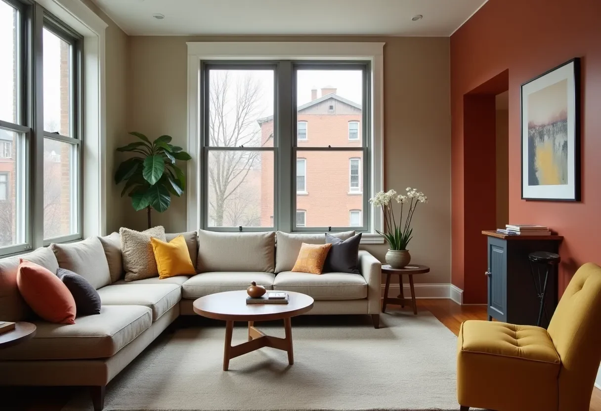
The best colors for a living room that works year-round in Chicago are usually warm neutrals or soft earth tones. Think creamy whites, light greige, or a gentle mushroom tone on the walls. These pair easily with both cool gray sofas and warmer wood floors.
In a Lakeview condo living room that felt cold every winter, simply swapping a sharp blue-gray for a warmer greige and adding a few wood accents made the space feel inviting even in February. That kind of shift is common when interior painters in Chicago nudge wall colors a bit warmer.
Kitchen: Clean but Not Sterile
Kitchens should feel clean and bright, but pure cool white walls plus white cabinets can feel clinical in winter. Try:
A soft, warm white or light greige on walls.
A slightly deeper neutral or muted green on lower cabinets or an island.
Warm metal hardware and wood accents to keep things grounded.
If you are dealing with a small Chicago condo kitchen, keep walls light and use color in the backsplash or accessories so the space does not feel crowded.
Bedroom: Calm and Cocoon-Like
The best bedroom paint colors usually come from the calmer side of the spectrum: soft blues, blue-greens, muted greens, or warm neutrals. In north-facing Chicago bedrooms, warm beige, greige, or a muted sage can feel restful without going gray and gloomy.
For small bedrooms in garden units, go a bit lighter and warmer than you think you need. Low natural light will naturally darken and cool the color.
Bathroom: Fresh, Bright, and Forgiving
Bathrooms tend to be small and full of hard surfaces, so you want colors that feel fresh but not icy. Consider:
Soft warm white or pale greige with white tile.
Muted blue-green for a spa feel, paired with warm brass or wood.
Deeper moody colors (ink blue, charcoal) in powder rooms with good lighting.
Remember that most bathrooms rely on artificial light. If your bulbs are very cool (daylight), a cool wall color can look almost clinical. Pair cool tile with slightly warmer paint or warmer bulbs.
Home Office and Hallways: Focus and Flow
For a home office, aim for focus and clarity. Soft greens, blue-greens, or balanced neutrals work well. Avoid overly saturated reds or bright yellows, which can be distracting during long Zoom days.
Hallways in typical Chicago layouts—long condo corridors or narrow two-flat halls—are a great place for your main neutral. Keeping them light and consistent helps your home feel larger and gives your eye a place to rest as you move from room to room.
If you would like a second set of eyes on your room-by-room plan, a short Chicago paint color consultation with Noir Painting can help you refine a palette that works with your specific layout, floors, and furniture.
Step 4: Test Your Paint Colors the Smart Way
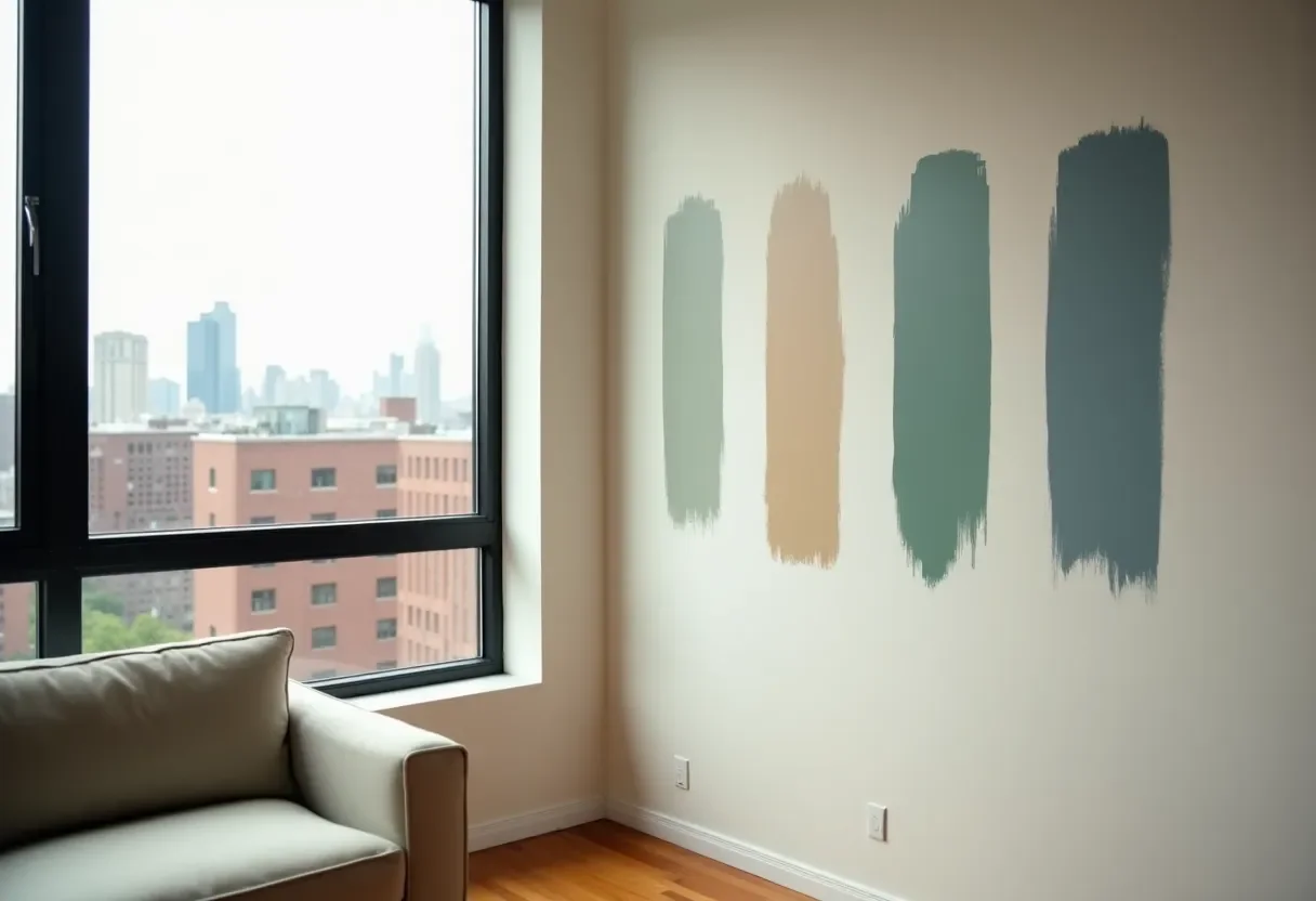
The right way to test paint colors is to try them on your actual walls in large swatches and look at them over a few days in different light. Tiny chips under store lighting will not tell you how that color behaves in a cloudy January afternoon in Chicago.
Major paint brands consistently recommend painting good-sized test areas and living with them before committing because light and nearby finishes dramatically affect perceived color and undertones ([Benjamin Moore paint testing advice](https://www.benjaminmoore.com/en-us/get-started/color-basics/sampling-paint-colors), [Sherwin-Williams sampling tips](https://www.sherwin-williams.com/en-us/homeowners/color/learn/try-colors-on)). Here is a simple process you can follow:
Narrow down to 2–4 options per room using your mood words, light direction, and whole-home palette.
Get real samples—either peel-and-stick swatches or small sample cans.
Paint large patches (at least 2x2 feet) on multiple walls in the same room, especially near windows and in darker corners.
Check them at different times—morning, midday, and evening, on sunny and cloudy days.
View next to fixed elements like floors, countertops, tile, and big furniture, because undertones will show up there.
Common Chicago-specific testing mistakes include:
Choosing cool gray from a Pinterest photo, then realizing it looks blue and cold in a north-facing living room in February.
Picking a “warm white” without testing it next to bright white trim, which makes the walls look dingy.
Ignoring artificial light—daylight-balanced bulbs vs. warm bulbs can make the same color feel completely different at night.
Take photos of your samples at different times of day and compare. If one color consistently looks good—even if it is not the one you expected—that is usually your winner.
When to Bring in a Chicago Interior Painter for Color Help (and How Noir Painting Works)
You should call a professional when the stress of choosing colors or tackling the work yourself starts outweighing the fun of a fresh space. If you are paralyzed by options, dealing with tricky light, or painting large areas in a Chicago home or condo, teaming up with experienced interior painters in Chicago will save you time, money, and frustration.
Noir Painting is a Chicago-based company that focuses on intentional, detail-driven interior painting. After painting hundreds of rooms across condos, bungalows, two-flats, and small businesses, the team has seen how the same swatch can behave totally differently in a Bucktown garden apartment vs. a South Loop high-rise. That experience feeds directly into the way they help you choose colors.
Here is how a typical project with Noir Painting usually flows:
Walkthrough and conversation. You talk about how you use each room, how you want it to feel, and what is not working now.
Light and finishes check. They look at your natural light, existing floors, countertops, cabinets, and key furniture pieces.
Color suggestions. You get a short list of Chicago-friendly colors and a simple whole-home palette that fits your style and budget.
Scheduling and prep. Once colors are set, they handle surface prep, protection, and high-quality paint application.
Walkthrough and touch-ups. You review the finished spaces together and make sure everything feels right.
If you would rather not spend your weekends swimming in paint chips, Noir Painting can combine a Chicago paint color consultation with full interior painting services in Chicago neighborhoods like Logan Square, Lincoln Park, Wicker Park, the Loop, and nearby areas.
Quick FAQ about Interior Painting Chicago and Color Choices
How do I choose paint colors for each room?
Start by deciding how you want each room to feel, then choose warm or cool color families that support that mood and work with your light and finishes. From there, build a small whole-home palette and assign a main neutral plus one or two accent colors to different spaces, making sure you repeat colors so your home feels cohesive rather than random.
What colors work best in Chicago’s gray winters?
In gray Chicago winters, warm whites, creams, greige, taupe, and soft earth tones usually feel better than crisp cool whites or icy grays. These colors add a sense of warmth and depth when natural light is weak and help rooms feel inviting instead of flat or chilly.
Should all my rooms be the same color?
You do not have to paint every room the same color, but reusing one main neutral throughout hallways and shared spaces helps your home feel bigger and more intentional. Then you can layer in slightly deeper tones or accent colors in specific rooms like bedrooms, dining rooms, or an office while still staying within the same overall palette.
How do I test paint colors the right way?
Paint large test patches on multiple walls, look at them over several days in different light, and always compare them against your floors, trim, cabinets, and big furniture. This approach reveals undertones and stops you from choosing a color that only looked good under store lighting.
When should I hire interior painters in Chicago instead of DIY?
Hiring pros makes sense when you are repainting large areas, working with high ceilings or tricky stairwells, or when color decisions feel overwhelming and expensive to get wrong. A team that offers both interior painting Chicago services and Chicago paint color consultation, like Noir Painting, can help you nail the palette and handle the prep and painting so you end up with a result you are proud of.
Bringing It All Together (and Your Next Step)
If you follow a clear process, choosing interior colors stops feeling like a guessing game. Start with how you want each room to feel, layer in Chicago’s light and seasons, build a small whole-home palette, and test your favorite options directly on the walls. Focus on warm or balanced neutrals and soft earth tones for main spaces, then mix in richer blues and greens where you want more mood.
When you are ready to turn that palette into freshly painted walls, Noir Painting can help you refine your choices and handle the entire project—from careful prep to clean, durable finishes. If you are planning interior painting in Chicago and want colors that work in real Chicago light, you can request a quick on-site estimate and let a seasoned team guide you through the final decisions so your home feels good in July and just as good in February.